Set It Up: Set Action FUNdamentals (pt. 2/4)
If you missed the first instalment of this four-post-series, I suggest going back to quickly recap on what we had before Set and Parameter Actions.
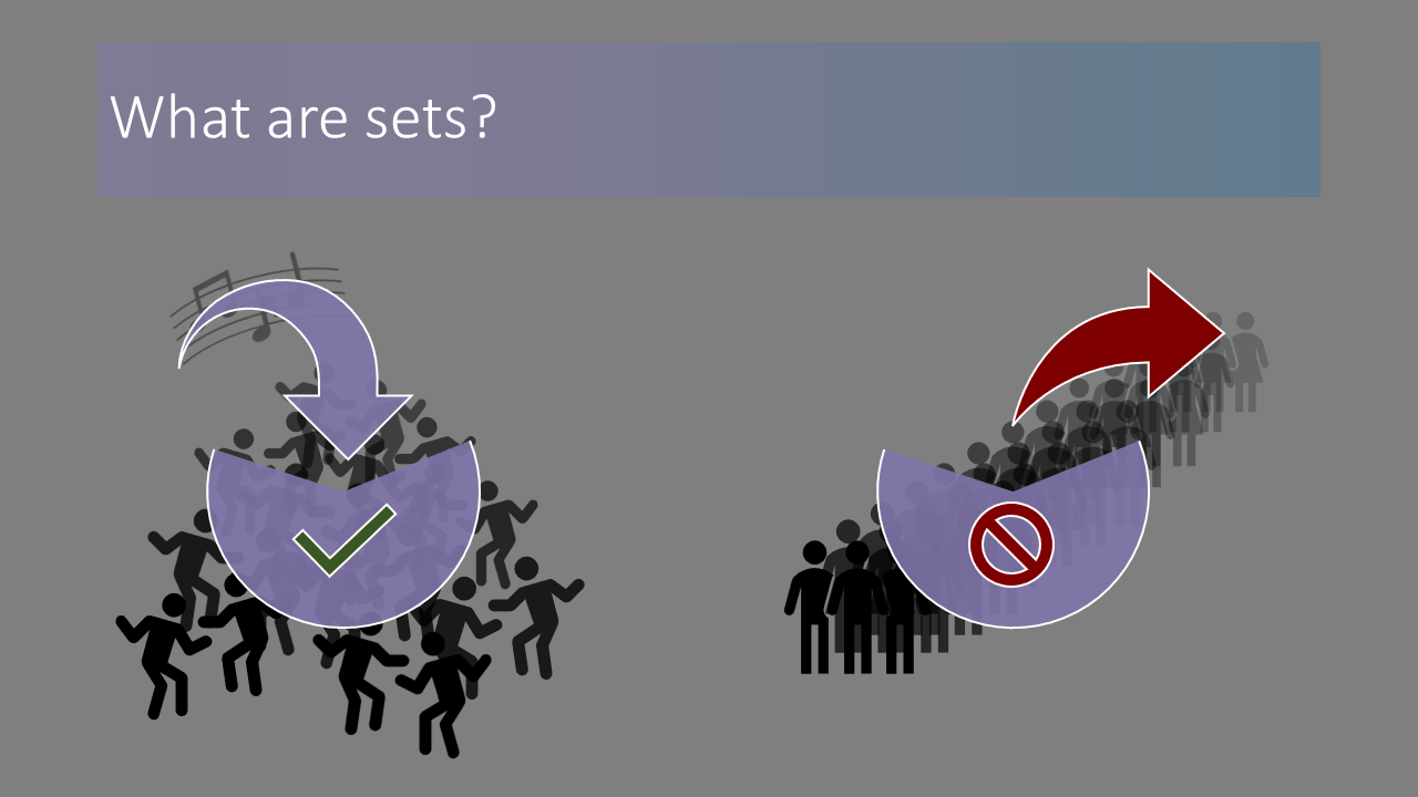
In my trainings, I like to describe Sets as similar to an exclusive nightclub: you’re either IN, or you’re OUT. There’s only those two options.

You can create a Set for a specific dimension, and choose which of the values in this dimension should be in the Set. Technically speaking, a Set works like a Boolean field, writing true or false into every row of your data set, depending on whether a row is in the Set or not.
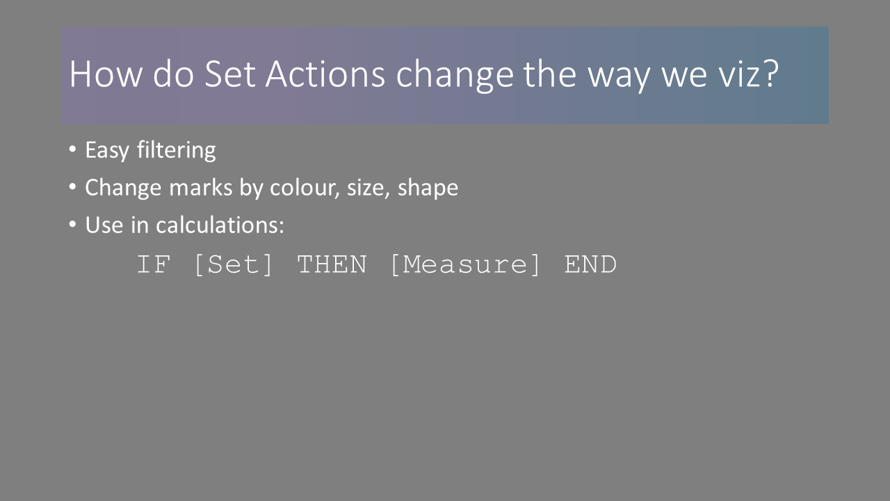
We can use these Sets for many purposes: often they are used for easier filtering, as you only have to drag and drop them into the Filter card and Tableau will automatically keep only your IN values.
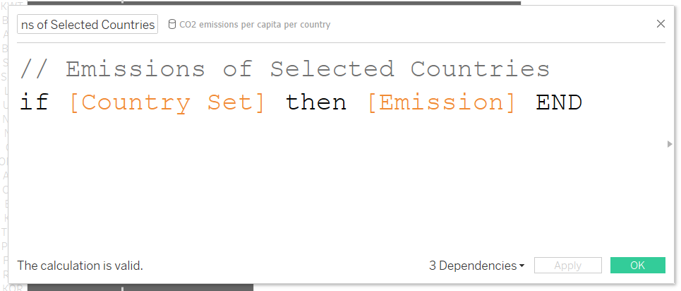
But you can also drop your Set onto Colour, Size, or Shape in the marks card in order to change the way your marks are displayed. And, of course, you can create calculations around your sets. One you will probably find yourself returning to time and again will be structured something like this: IF [Set] THEN [Measure] END. Since the Set is a Boolean field, nothing more is needed in your condition. You will use this to filter implicitly, rather than explicitly, when you still want to see other values in your sheet, but also limit one measure to only the values contained in your Set.
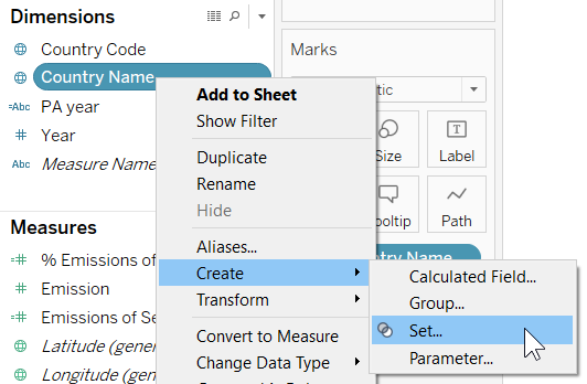
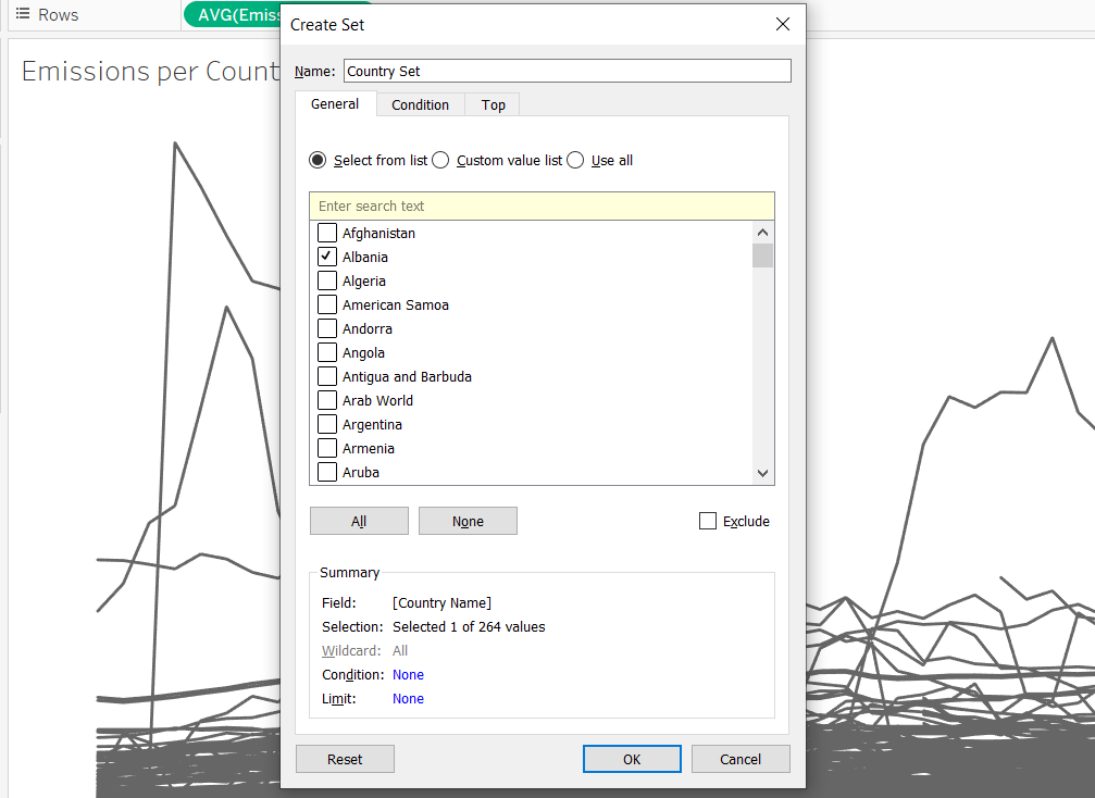
In my last blog post, I talked about how limiting Highlight Actions can be. Now, let’s see how the new Tableau features can help us out here, taking the same sample dashboards. Since it’s always the same field I want to concentrate on, a Set Action is just fine for us. I go to any sheet and create a Set from the field Country Name. I start by selecting any country – doesn’t matter which one – and now I have my Set.
Since I want to visually emphasize the marks in my Set, I put this Set to colour. Immediately the one country I selected stands out. In my line chart, I can also put my Set to Size and reverse the sizing, so that countries in my Set are shown by thicker lines.
I also put my Set onto colour in my bar chart. Now, I also want to see and keep a reference line for the selected countries. So I create a calculated field as mentioned earlier: IF [Country Set] THEN [Emission] END
I put this field to detail and add a reference line to my bar chart. I now have two reference lines – one for all bars and one for the selected bars – and I don’t want either to be recalculated, so I deselect that option for both of them.

I want my second dashboard to be affected, as well, so I go to my sheets and add the Set to colour here, as well. I can now remove countries from my donut chart. Please, if you ever think that a donut chart with 250 slices is a good idea, please get help. Maybe this TFF talk will help.
There’s also another sheet hidden in this dashboard which I reserved for a BAN. I’ll create another calculated field to find out which percentage of my total CO2 emissions are emitted by the selected countries. I’ll simply divide the sum of emissions from the selected countries by the sum of all emissions, and we’re ready to go. No LOD necessary, just a simple weighted percentage. Format the default properties, set the field to Label, and this is it.

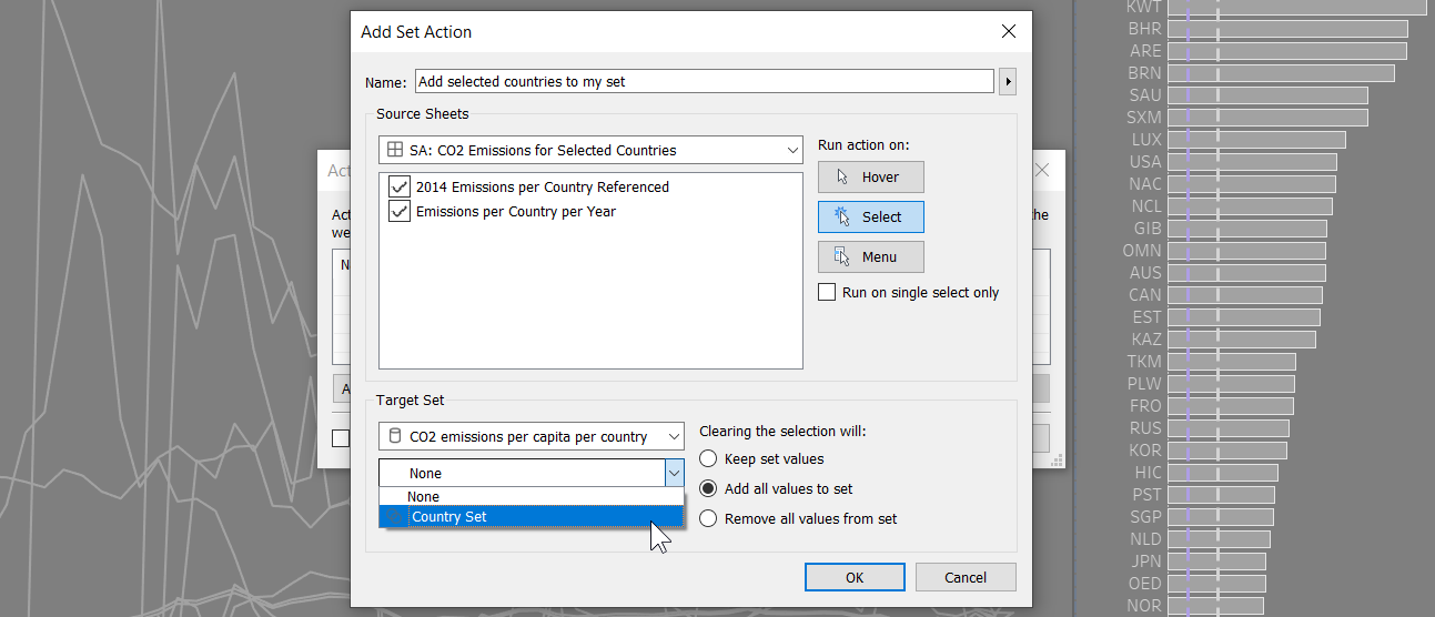
Let’s return to the first dashboard and add the Set Action. From either sheet, by selecting a mark, I want to add those values to the Country Set I just created. Note that since Sets always stick to one field, I don’t have to specify which field Tableau should concentrate on, but because this field is in a particular data source, I have to choose which data source to pick the Set from. I don’t have to specify any target sheet, either. The Set Action will simply change how other sheets using this Set are displayed, without me needing to specify the scope of this Action.
When deselecting, I want to keep my Set values, because that’s one of the main advantages we have over Highlight Actions. And that’s it. We’re ready to go.
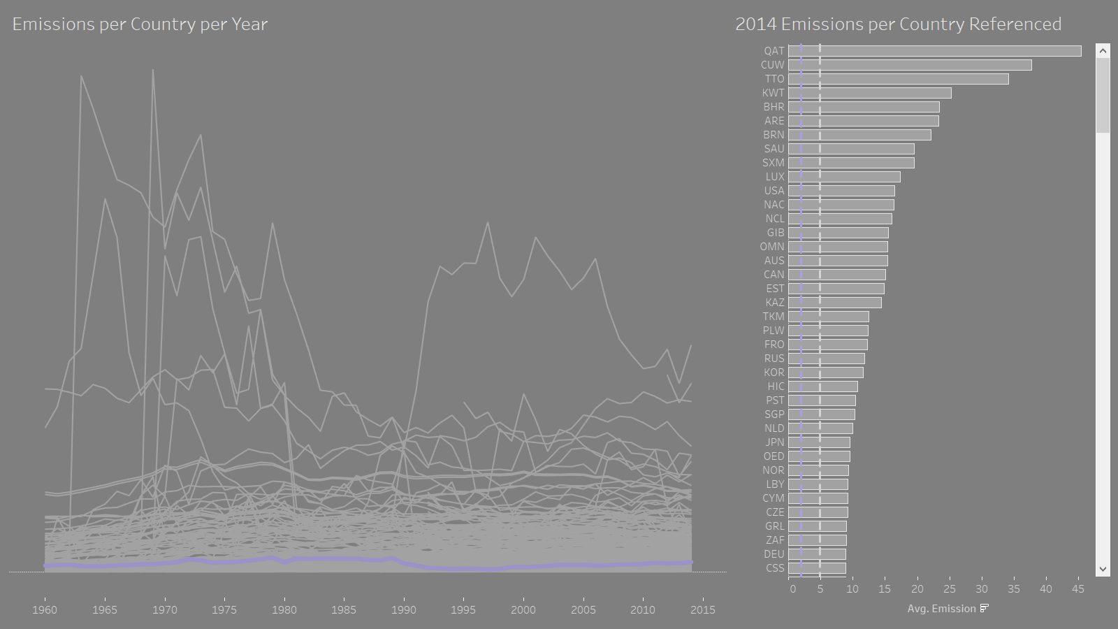
If I select a line now, the bar will be coloured accordingly, and vice versa. It works with multiple lines as well. You also see how the reference line for the selected bars gets recalculated and stays put every time I change the values within my Set.
Let’s check all this out in the other dashboard, as well: If I choose a few bubbles in here, the size of the slices in my donut chart will change, my BAN will change, and if we go to our first dashboard, the bars and lines of the selected countries are coloured as expected.
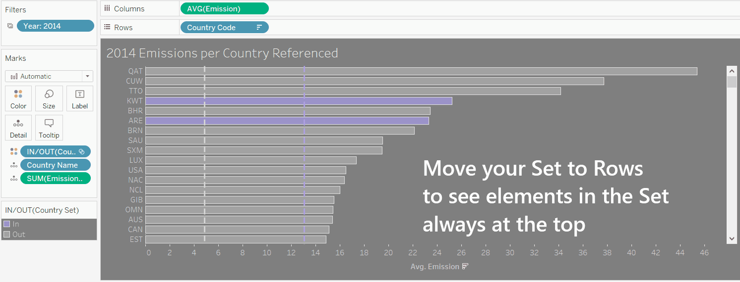
If I want to see at a glance which bars are in my set without scrolling through all 250 rows, I can also put my Set to Rows in front of Country, and all selected bars will be moved to the top. Hide the header, and you’re ready to go.
Of course, you can push this as far as you like. I just want to give you a quick overview of what Set Actions can do: they can be used as an easy way of filtering – both including and even excluding, which Filter Actions can’t accomplish at the moment. You can use them to change the colour, size, shape, and as we’ve seen, sorting of your marks. You can use them to change the scope of your calculated fields, and they will react to the selection of individual and multiple marks at a time.
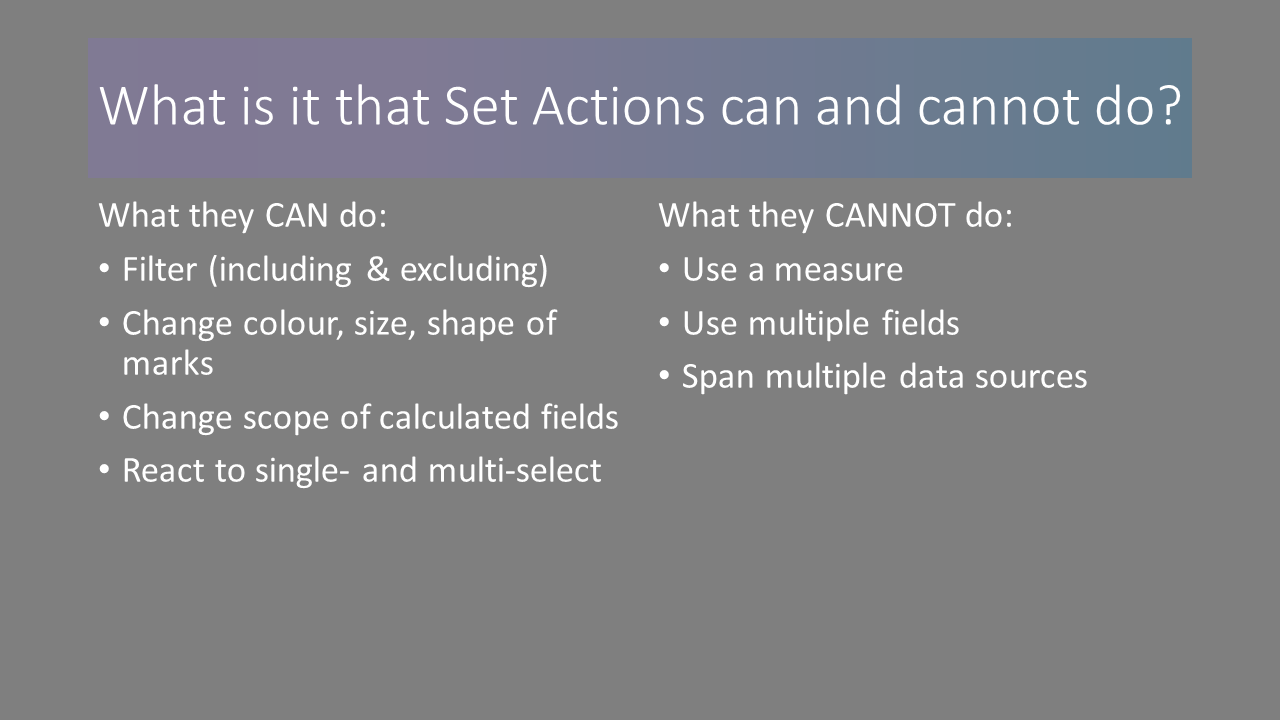
However, there’s a few things Set Actions can’t do at the moment: they won’t react to measures, and they always stick to one field only, meaning you can’t use them across multiple fields or even across multiple data sources.
That’s where Parameters come into play, which you will learn about in my next blog post: Parameter Action FUNdamentals.
Please also check out the following resources on Set Actions for more advanced play: