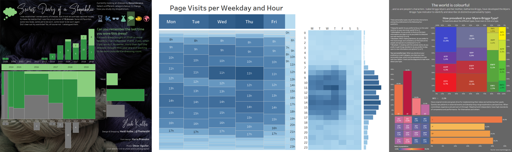
Marimekko Unchained: Going Crazy with Design
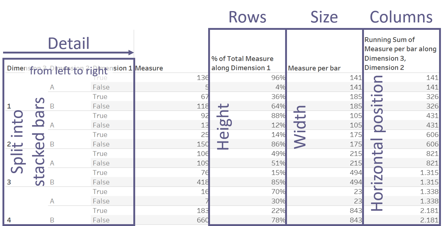
You made it through the first, very fundamental steps. You’ve chosen your dimensions and the order in which to use them, you’ve selected your measure, used table calculations and LODs to find the height, width, and position of your bars, and you’ve laid it out in a table to make certain everything is looking correct. And it does look correct, so you’re ready to delve into the next step.
Step 4: Arrange everything
This is where the 80-20 rule reaches its most vicious point. But no worries, there’s actually not an awful lot to be done.
Let’s take it easy first: let’s pave our way from table to the actual Marimekko.
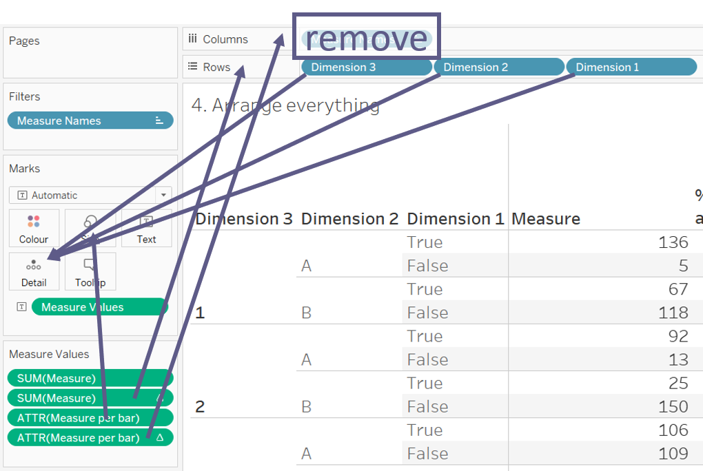
Your dimensions will be what splits your measure into the stacked bars, so those will have to go to Detail. The percent-of-total calculation is the height of the stacked elements, so naturally this will go on Rows. Your Measure Per Bar is the width of the bars, so you’ll drag this to size, and your running sum is the horizontal position, so this is needed in Columns.
And this is exactly what we do. Move your dimensions out of the Row container and drop them onto Detail, going from left to right (trust me). Remove Measure Names from Columns and drag the percent-of-total of Measure to Rows, Measure Per Bar to Size, and the running sum of Measure Per Bar to Columns. Your Measure pill will automatically jump to Detail.
“Wait, what?,” you may think. “A scatterplot? This is not what I came here for – is it?”
Oh, ye of little patience.
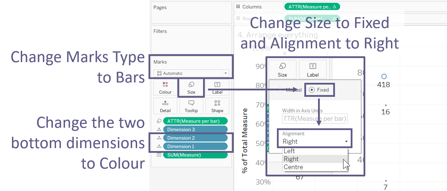
Change your Mark Type to Bars. Change Size to Fixed and Alignment to Right. Personally, I like to change my Dimensions 1 and 2 to Colour (when using three dimensions; otherwise it can be helpful to drop your Measure onto Colour). This will give you a nice two-level colour scheme that helps you differentiate between the different combinations of the dimensions’ elements.
Now you just need to sort the elements within your dimensions if needed (and if you haven’t done so before), clean your labels, and fix and hide your axes. I suggest you fix your vertical axis to 100% and your horizontal axis to the overall sum of your Measure.
At last you will have something like this.
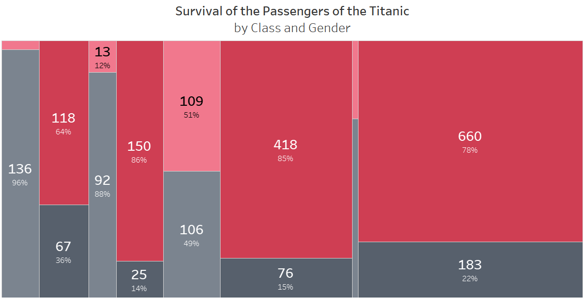
You can easily distinguish between the segments of the bars by colour. You don’t really know which group of bars is which element of your Dimension 3, though, unless you label obnoxiously or hover over every single mark. Ideally, that’s not something we want to have to do, so let’s get to the next step instead.
Step 5: Add a header
For this we need an extra chart which is a simple stacked bar. Drag your Measure to Columns and your outermost dimension (Dimension 3 in case of three dimensions) to Label. Sort your dimension reversed to the order you used in the Marimekko in order for the segments to appear in the correct order. (Alternatively, you could reverse your axis.)
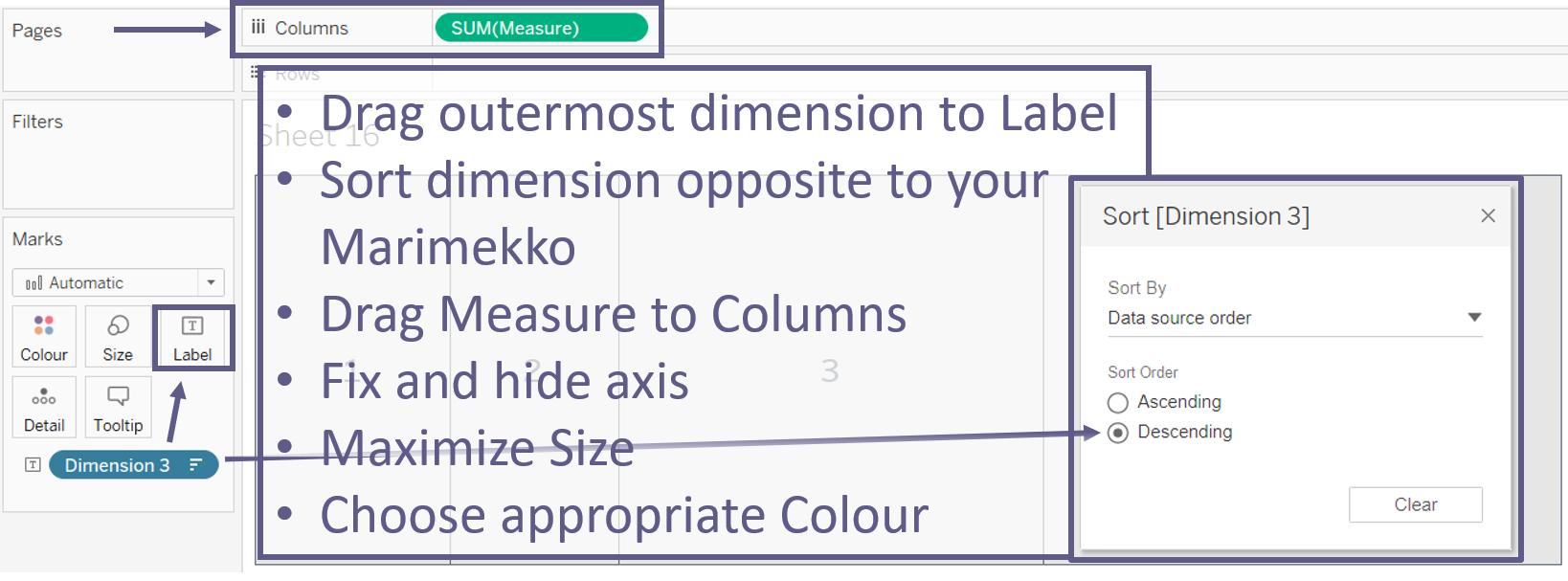
Now fix and hide your axis, maximize the Size, choose an appropriate Colour for your bar, and fiddle with the Labels until you’re happy. Add your header chart to the dashboard. I suggest using a horizontal container in order to always align the header and the Marimekko perfectly. I sometimes like to lessen or remove the padding between the two charts, but that’s just personal preference.
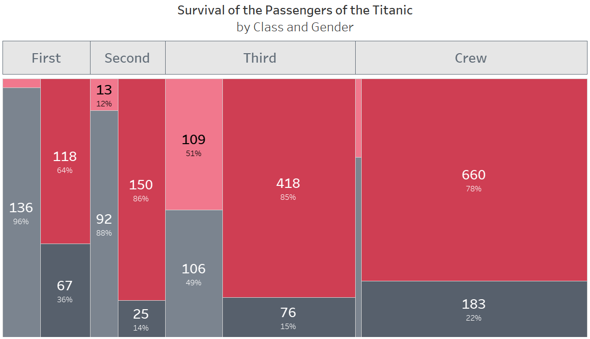
Voilà! There goes your Marimekko chart with a fitting header.
What limitations to Marimekko charts are there?
One feature limitation we have in Tableau at the moment (talking 2019.4 here) is the fact that we can’t build a horizontal Marimekko – at least not as easily as we can build a vertical one. As soon as we have two axes and choose the Mark Type Bars, Tableau will default to vertical bars. I guess you could create a horizontal Marimekko using Polygons with some fancy calculations. (In fact I’m somewhat counting on Klaus Schulte or Kevin Flerlage to stumble upon this post and do just that…) Personally, I’m perfectly content with my vertical Marimekko charts for now.

This next one should go without saying, but I’ll say it anyway: don’t use negative figures. Both the percentages of the segments and the width of the bars would be off if any combination of your dimensions yields a negative sum of your measure.
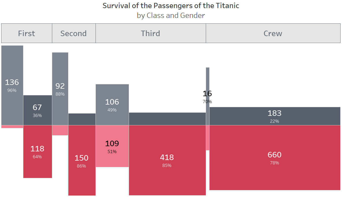
The only exception to that rule would be if you wanted to go for a diverging Marimekko chart. Please note, however, that all numbers are positive here. I simply wrapped an if-statement around my percent-of-total calculation.
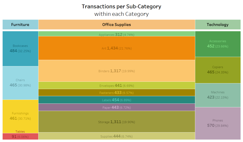
Don’t use subdimensions with different attributes in the superior dimension. The aim of a Marimekko is to compare the magnitude of the same attribute of your innermost dimension across all or at least multiple attributes of your outer dimensions. Think Superstore: it doesn’t make any sense to compare the Sub-Categories across the Categories, as no Sub-Category appears in more than one Category.
Don’t use too many bars. This goes hand-in-hand with what I said about Step 1 of the building process in my last blog post: If you use too many dimensions, your bars will become tiny and impossible to compare to one another.
The same goes for segments: don’t use an innermost dimension that will split your bars into more than two or at most three segments, as they will be difficult to compare across multiple bars.
How can we spice things up?
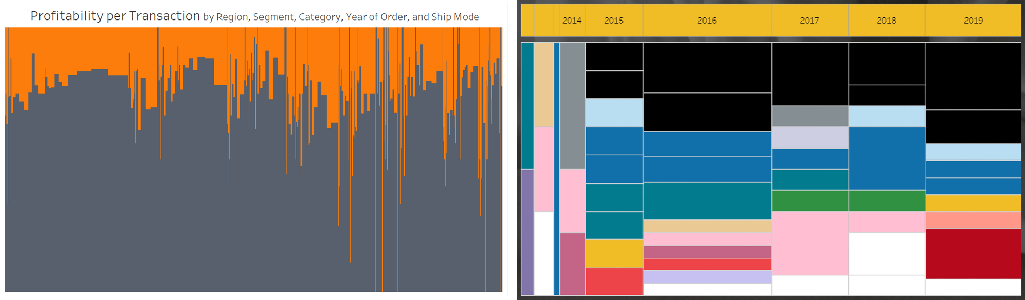
I love Marimekko charts, but sometimes you just need to spice them up a bit. My go-to spice are marginal histograms – bar charts with a fancy name, basically. I like to use them both horizontally and vertically, depending on the use case. When using only two dimensions, I sometimes add in a heatmap for extra taste. They can help users who are somewhat wary of Marimekko charts smooth their way into loving them.

Where can I learn more?
If you’re now as obsessed with Marimekko charts as I am, congratulations! I especially recommend checking out Lindsay Betzendahl’s article “Don’t Mekko with My Marimekko”. If you want to read up on the inner struggles of a man who really didn’t want to love Marimekko charts, check out Steve Wexler’s “Dr Strangechart Or How I stopped worrying and learned to love appreciate the Marimekko”.
And again, if you’re looking for even more detailed instructions on how to build the Marimekko chart in Tableau with screenshots and hints for troubleshooting, check out Jonathan Drummey’s post or, if German is easier for you, my blog post for The Information Lab.
If you have a friend who should know about Marimekko charts but they hate reading for some reason, of if you would like to enjoy this same content once again over morning coffee, check out my talk for TFF APAC 2019 on YouTube.
Please feel free to tag me on Twitter in any Marimekko charts you build, and do chat me up about pros / cons / worries / general adoration of Marimekkos!