Marimekko Unchained: Laying the Groundwork
Marimekko is a Finnish lifestyle design company founded in 1951. It is especially known for its brightly coloured, patterned prints. If you’ve seen photos of Jackie Kennedy in the 1960s, campaigning for her husband’s presidential election, chances are that you’ve seen her in a Marimekko dress.
“Wait, what?,” you may think. “Fabric designs? This is not what I came here for – is it?”
Not to worry, you did not stumble into a fashion blog. (Sorry to disappoint the fashionistas and home decorators amongst my readers.) Let’s delve into Marimekko the chart type.
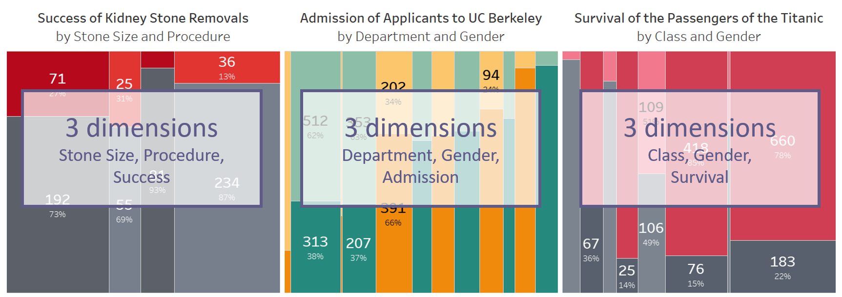
Marimekko charts display a curious pattern of rectangles of varying sizes, and they can also be brightly coloured, as this following chart shows.

Marimekko charts combine relative and absolute values. They show a more wholistic picture of the story behind your data by displaying both the weight within every group as well as the weight of the different groups. In my last blog post, we already discussed why this is of the utmost importance in some cases (codeword: Simpson’s paradox).
But now that you know that we need the Marimekko, how can you build it in Tableau? Are there any mistakes you should avoid? And if matters should get boring, could you spice things up a bit?
All this will be discussed this blog post and the next.
How can we build a Marimekko chart?
There’s a wonderful blog post by Jonathan Drummey out there that I’ve read more times than I’m willing to admit. I also published a German version of his step-by-step instructions for The Information Lab Germany a while back, so any German readers, feel free to check that one out.
For the purpose of this post, I’ve simplified Jonathan’s very detailed instructions down to five steps (with multiple actions each, so it’s not actually shorter, but maybe you can remember this one better). The steps are as follows:
- Choose your structure
- Set height within bars
- Set width of bars
- Arrange everything
- Add header
Let’s start with…
Step 1: Choose your structure
What do I mean by this?
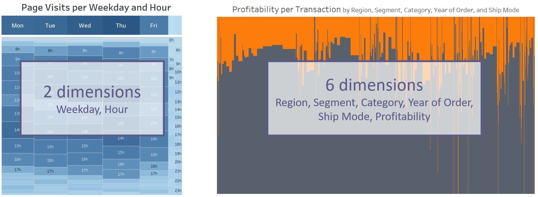
In this step you decide on which dimensions you want to use. In theory, the Marimekko chart can take any number of dimensions from one to a gazillion. In all actuality, however, you will want to take two or three dimensions. A Marimekko based on only one dimension is more commonly known as a stacked bar, so there’s no need to read this blog post any further if you’re only after that. And anything more than three dimensions becomes illegible, and no level of data literacy will save your users from the resulting skyscraper chart. (Try it out and see what I mean.)
You will usually go for three dimensions, as this is the most common use case where the Simpson’s paradox appears. (Incidentally, the left and middle example out of the three shown below are the two use cases you will find whenever you try to read up on the Simpson’s paradox.)

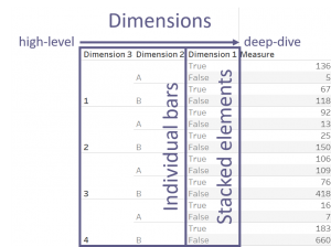
Now, the following is something you will very rarely hear me say. In this case, however, it’s actually quite helpful: build a table. Jonathan uses this trick and I’ve found it to be immensely reassuring that you’re getting your numbers right before converting it into a Marimekko chart.
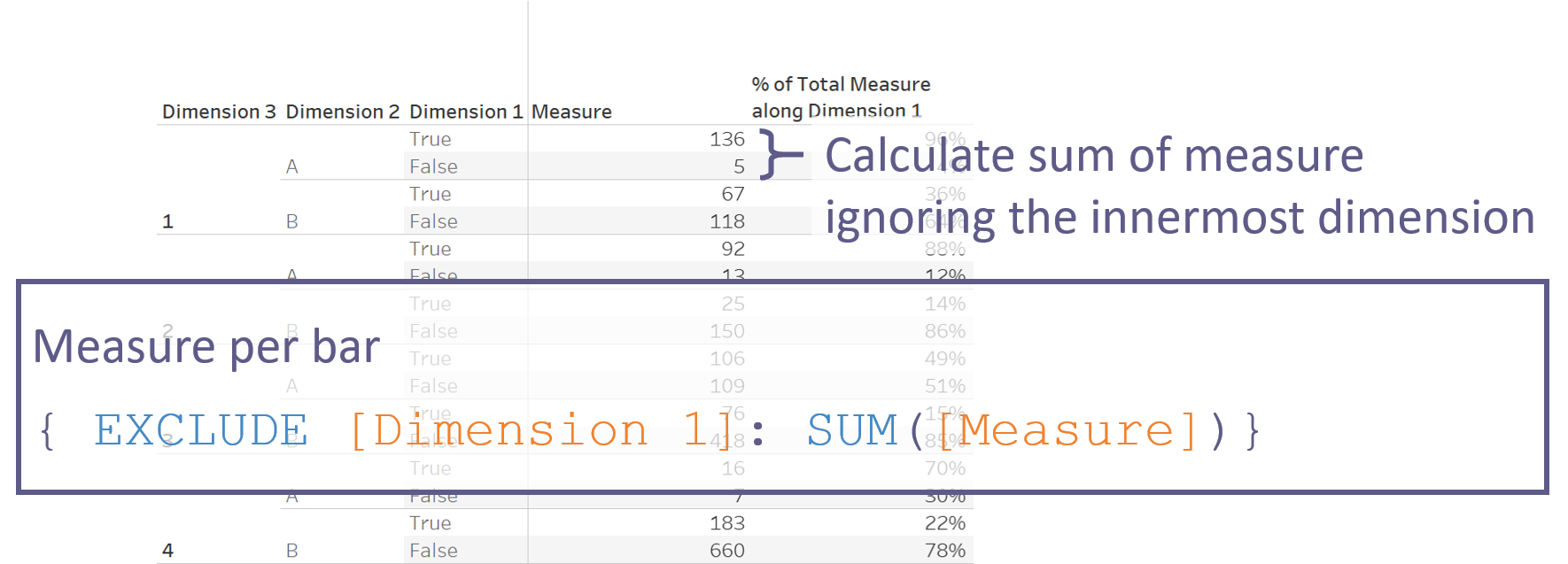
In your table, place your dimensions on Rows. You will find that I’ve numbered them in the screenshot, and not without a good reason. You need to decide on the order of your dimensions at this point already. Reworking everything later would otherwise be a real hassle.
As you can see, I’ve numbered them from the inside out. The innermost dimension (Dimension 1 here) will be the one that stacks your bars. All other dimensions will make up the individual bars placed next to one another. I’ve named my measure simply Measure here to make it easier for you to create on your own later.
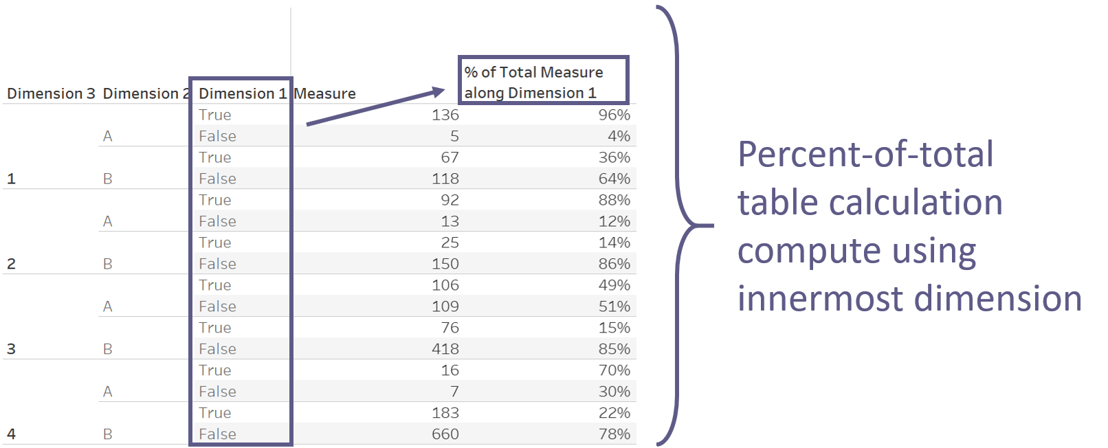
Step 2: Set the height within your bars
As mentioned above, the innermost dimension will be the one to create your stacked elements. Within every combination of the higher dimensions, you will want to know what percentage are the elements of your Dimension 1. We simply use a Percent-of-total table calculation here and compute using Dimension 1.
Step 3: Set the width of your individual bars
This is where we decide how weighty your bars are. For this, we need to know the sum of your measure within every combination of the higher dimensions, ignoring the innermost dimension. You’ve guessed correctly: this demands an LOD calculation.
{ EXCLUDE [Dimension 1]: SUM([Measure]) }
I will call this field “Measure Per Bar” and refer to it as such for the remainder of this blog post.
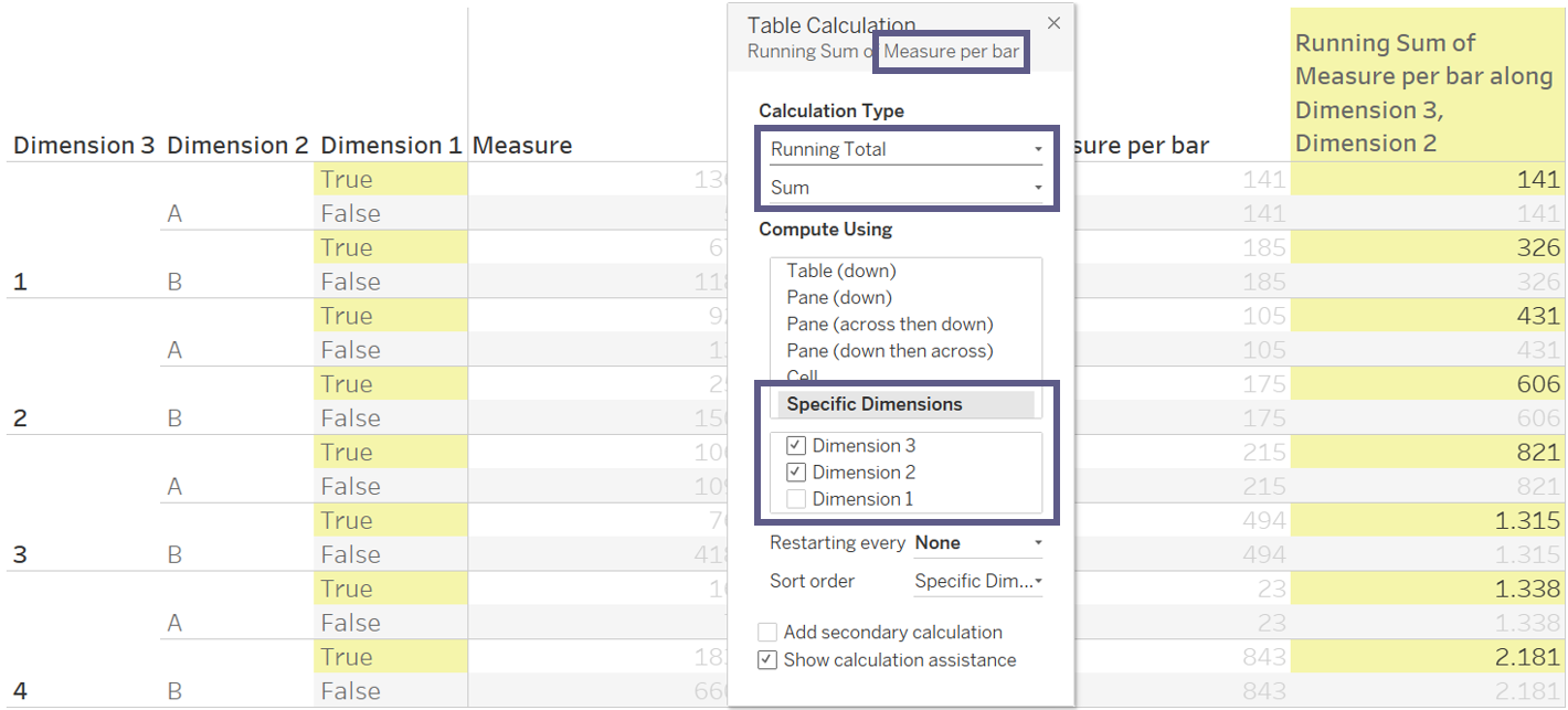
Now that we have the width of each bar in our Measure Per Bar, we just need to find out where to actually place the bars. Here we simply want the cumulated width of the bars – yep, another table calculation is in order. We take the Running Sum of our Measure Per Bar and compute using specific dimensions, namely every dimension from the highest number to the second lowest, not computing along our Dimension 1. Even if the calculation should incidentally show the correct numbers without you needing to fix the computation, I still suggest you do so now. If it’s on Tableau’s automatic computation, this might change when rearranging everything later. It’s infinitely easier to just fix it now rather than needing to come back to fix it at a later point.
“Wait, what?,” you may think again. “A table? This is not what I came here for – is it?”
Well, no and kind of. No, because of course I’m not going to leave you at that. And kind of, because you’ll need to skip ahead to my next blog post to learn more about how to move everything into the Marimekko that I love so much.