Shaded tooltip backgrounds and other creative uses of colour
These are tips 11-13 of my Tableau Speed Tipping session. Refer to the Table of Contents to find the other tips.
-
Use viz in tooltip to colour tooltip backgrounds
I want to shade my tooltips in the same way as I am colouring the marks. In my case, I’m showing countries on a world map, coloured by the world region to which they belong. Tableau doesn’t make shading tooltips very easy, but we can accomplish this anyway – since version 10.5.
Simply create a sheet with a bar chart, labelled with the text you want to appear in the tooltip. Use a helper axis for your bars, e.g. MIN(1). Edit the axis so that the bar fills the whole view. Hide the headers, both for the axis and for the dimension in your rows container. Colour the same way as your original sheet. It might be wise to lessen the opacity of your bars. Center-align your labels and make sure to drag the size slider to the very right. Make the chart fill the entire view.
Now return to your original sheet and open the tooltip editor. Get rid of the text there and insert your sheet. Adapt the size to whatever is appropriate here. And that’s all – now your tooltips are shaded.
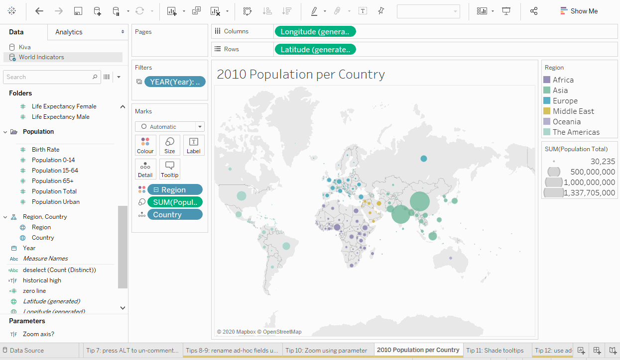
Many thanks to Christina Gorga for demoing this trick at the Tableau Tip Battle at TC19 in Vegas!
-
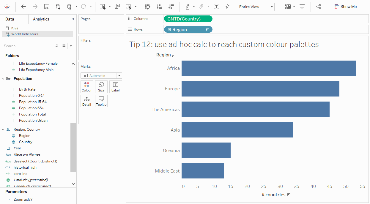
Use ad-hoc calc to reach custom colour palettes
You want to use your custom colour palettes. When you drag a field to colour, that’s simple, provided that you’ve added your custom colour palettes first.
But what do you do when you want everything to be the same colour? The standard colours don’t feature your CI colour, you don’t know the HTML code by heart, and you don’t have your company logo handy in order to use the colour picker. What now?
Simply double-click in your marks card, add an ad-hoc calculation (my go-to is “asdf”), and assign this field to Colour. Now you get the edit colour dialogue you were looking for, and can reach your custom colour palettes.

Many thanks to Mark Edwards for showing this trick at the Tableau Tip Battle at TC19 in Vegas!
-
Colour historical all-time highs using RUNNING_MAX
When showing a development over time, you might wish to highlight historical record highs, meaning values that were the highest of all time at the point in time when they were measured. Simply create a calculated field with the following calculation:
SUM([Your Measure]) = RUNNING_MAX(SUM([Your Measure]))
This will result in a Boolean measure which you can then drag to Colour. Change the colours accordingly and you will have highlighted the historical record highs.
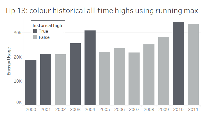
Thanks go, once again, to Vince Baumel for this clever trick as shown at the Tableau Tip Battle.