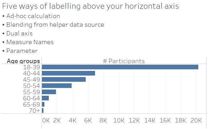
Five ways of labelling above your horizontal axis in Tableau
If you ever find yourself wanting to label on top of your horizontal axis, there are five simple ways in which you can do that.
- Ad-hoc calculation
- Blending from a helper data source
- Dual axis
- Measure names
- Parameter
Most of these tricks work only for a single axis in your chart. Allow me to walk you through them one by one.
1. Ad-hoc calculation
Simply double-click in Columns, type in the desired axis header in between quotation marks, and press Enter. This will create an ad-hoc calculation where your desired text is the result. Now right-click on the header and select “hide field labels for columns”, as well as double-click (or right-click and Edit) on your axis and remove the axis title, because otherwise your chart will be labelled three times.

Careful: this text will be written into every row of your data set, so beware that this may not improve your performance with large data sources.
2. Blending from a helper data source
Use a helper data source to bring in your desired axis header. Personally, I like to open an Excel file or a text editor of my choice, type in two rows of text – one row for the field name, and one for the single row of data that my helper data source will contain -, highlight those two cells / rows, copy, and paste into Tableau. This will bring in a clipboard data source which exists only within your workbook. The drawback: you can never refresh that data source, as it doesn’t point anywhere. The benefit: you can very quickly mock up the necessary helper data, and you don’t even have to save that data source anywhere.
With your helper data source thus brought into Tableau, you start by creating your desired chart. Your main data source (the one with actual, relevant data in it) should now show a blue tick mark. If it shows an orange tick mark, start over. Then, go to your helper data source, and drag the desired header field onto Columns. Right-click on the header and select “hide field labels for columns”, and double-click (or right-click and Edit) on your axis to remove the axis title.
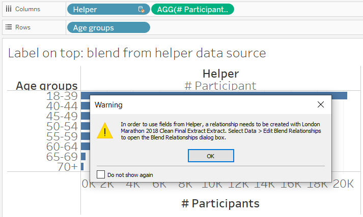
If Tableau warns you that no relationship exists between the two data sources, that’s exactly how it should be in this case. Simply ignore the warning for this very specific use case.
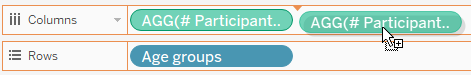
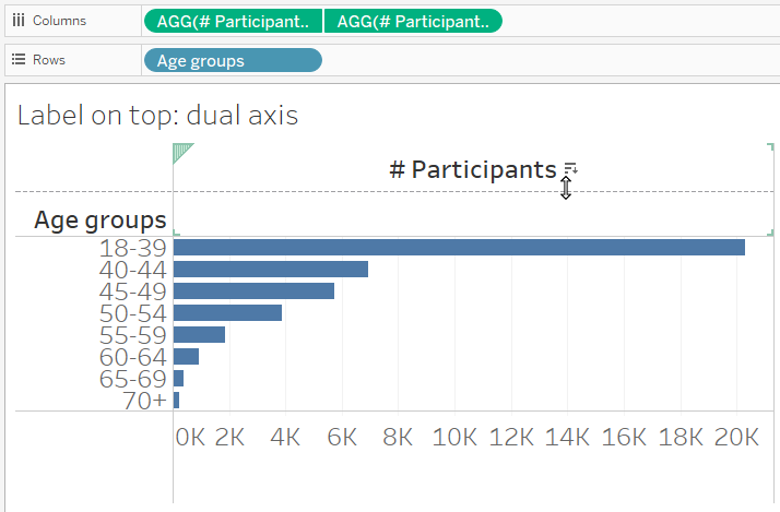
3. Dual axis
Duplicate your horizontal axis by holding CTRL while dragging your measure on Columns next to itself. You should now have two axes. Create a dual axis and synchronize. If you haven’t yet, change the Marks type to whatever you need for this chart.
Now double-click (or right-click and Edit) on your bottom axis to delete the axis title. Double-click (or right-click and Edit) on your top axis, navigate to Tick marks, and select None. Decrease the size of your axis until it fits as you like it.
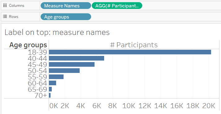
4. Measure names
This particular trick only works if you have just one axis. Simply drag Measure Names onto Columns. Double-click (or right-click and Edit) on your axis to remove the axis title. That’s it.
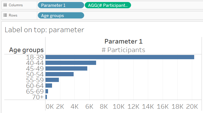
5. Parameter
Create a string parameter that contains the desired header text. You are probably not going to change this parameter ever, so don’t even bother showing the parameter control.
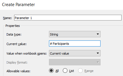
Simply drag the parameter onto Columns. As always, right-click on the header and select “hide field labels for columns”, as well as double-click (or right-click and Edit) on your axis to remove the axis title.
Adapting these tips for multiple axes
Depending on how your data set is structured, you will be able to adapt some of the above tricks. In case of the dual axis tip, you will need to create multiple pairs of dual axes, which may be tiring to maintain.
It may be best to use tip no. 4 here, Measure Names. Create your chart with the first axis, then drag the next measure that you want to make into an axis onto the first axis that you just created. With all further measures, you can either proceed in the same manner, or drag them into the newly popped up Measure Values box, or you can edit the Measure Names filter (automatically put into Filters by Tableau) and select the measures you want to keep. Then drag Measure Names (the last field under Dimensions, written in italics) onto Columns.
A word of caution: I must strongly suggest you follow the above instructions for how to bring your second measure into the view. I know it will be tempting to simply drag Measure Values onto Columns and later remove the measures you don’t want, but I very strongly recommend against that. Doing it in this way is nice and well as long as you have only a handful of measures. Usually, your dataset will contain twenty, fifty, or more different measures. If you simply bring all of them into the view, you may look at long loading times, and it will be a huge hassle getting most of the measures out of the view again. Please, do yourselves a favour and simply drag your second measure onto the same axis of the first measure. Thank you.
This tip was part of the Tableau Speed Tipping session for Beginners hosted by Annabelle Rincon and myself at Tableau Conference 2022. For more tips, see full list.
Find more tips like these in my Tableau Tip Battle with Annabelle Rincon at the Tableau Fringe Festival of December 2020: