Sankey charts in Tableau without data prep
You want to build a Sankey chart in Tableau and have read through multiple how-to’s and looked at numerous templates, but they all require you to multiply and / or completely reshape your data, and you really do not want to do that for just that one chart? I’ve got you covered. Read on to find out how to build your Sankey chart without any data prep.
Is this the right article for you?
Do you want to create a Sankey chart in Tableau? Do you want zero data prep for that chart? If you answered Yes to both these questions, read on.
Do you need your start and end dimensions to be different points in time (different rows within the same column)? Do you need a non-summable aggregated measure (such as count distinct)?
If you answered Yes to these questions, read on. If you answered No to both questions, please check out Ian Baldwin’s blog post because it has all the answers you need.
Do you want your different statuses beautifully spaced from one another? Well, tough luck, because I cannot help you with that. As far as I am aware, that will need some data prep. So either you are happy to take out one of those numerous templates mentioned above and reshape your data to fit that one chart type – or you are willing to make some concessions. If the latter is the case, do read on.
Are you fine with adding twenty new calculations to your workbook? Great, because I don’t believe there’s a way around that.
All these questions cleared up, let’s delve into things.
A word before we start
This blog post would not exist without Ian Baldwin’s fantastic instructions for a data prep free Sankey chart. I publish these adaptions with his permission and in endless gratitude for his blog post. I will freely admit that I don’t understand half the magic happening in the gazillion of table calcs we will encounter here. All this brilliance stems from Ian’s brain. I will be structuring my blog post using the same steps as Ian did, so you can always refer back to his post and find the same aspect in the instructions there.
The use case
You want to track your customers’ journey. More specifically, you want to find out how the distribution of your customers throughout the different journey stages changed from one point in time to another, counting your customers per journey stage. You want to be able to dynamically choose both points in time, and the Sankey should adapt accordingly.
Step 1: The basics
Decide whether you want to allow all dates or a range of dates taken from your data. In case of the latter, if you want to allow dates at a higher level of date detail (meaning: less detailed), create a calculated field that contains a DATETRUNC calculation for the relevant date field and your chosen level of detail (e.g., week, month, quarter, etc.). This will look something like this:
DATETRUNC(‘month’,[your date field])
If you don’t want to allow all values in there (e.g., only the last 2 years), adapt your calculation accordingly, so that your calculated field only contains the values you want to have end up in the filter.
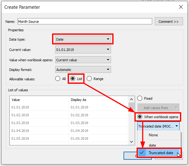
Set up two parameters for your start and end dates. I will call them Month Source for the start date, and Month Target for the end date. Set data type to date and allowable values to list. There you can select under “when workbook opens” which date field to choose the allowable values from. If your calculation doesn’t show up there, make sure to change its data type from date & time to date, then try again.
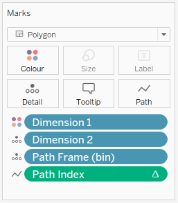
Now set up your dimensions. I will call them Dimension 1 and Dimension 2, same as Ian did, as it will make the following steps easier. You will need LODs here:
Dimension 1:
{ FIXED [customer_id]: MIN(IF DATETRUNC('month',[Month Source])=DATETRUNC('month',[your date field]) THEN [customer status] END)}
Dimension 2:
{ FIXED [customer_id]: MIN(IF DATETRUNC('month',[Month Target])=DATETRUNC('month',[your date field]) THEN [customer status] END)}
These calculations look at every single customer and check what status they had in the selected month. This calculation assumes that every customer has just one status every month. Otherwise you will get the status that comes first in alphabetical order due to the MIN function here. Adapt as needed.
Create a calculated field for your measure as well.
Chosen Measure:
COUNTD([customer_id])
All further steps will assume that you are using an aggregated measure. If you don’t, please refer back to Ian’s blog post.
Step 2: Densifying your data
This is the step where other templates will have you multiply your data using a self-union, or bring in a gazillion ETL steps in a software you may not have a license for. Ian simplifies this idea immensely (and brilliantly): we simply need “two data points to hang our data densification from”. We will be comparing the dimension we’re counting (the customer ID in my case) to the minimum in the whole data set.
I slightly adapted Ian’s calculation here. Instead of comparing the Chosen Measure to the minimum (which would require a nested LOD, since the Chosen Measure is already aggregated), we use the underlying dimension here that we base our count distinct on.
Path Frame:
IF [Customer Id]={MIN([Customer Id])} THEN 0 ELSE 97 END
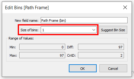
Now create bins from Path Frame with a size of 1.
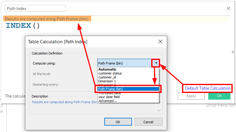
Step 3: Index
Set up an INDEX() calculation that computes along Path Frame (bins) as shown in the screenshot.
Path Index:
INDEX()
Step 4: Getting curvy
These two calculations are taken straight from Ian’s blog post.
T:
IF [Path Index] < 50
THEN (([Path Index]-1)%49)/4-6
ELSE 12 - (([Path Index]-1)%49)/4-6
END
Sigmoid:
1/(1+EXP(1)^-[T])
Step 5: Arm wrestling
This calculation was adapted very slightly as our Chosen Measure field contains already aggregated values. This ensures that each Sankey arm is sized by its percentage from the full data set. It assumes, again, that the sum of count distincs is the same as the total count distinct, because otherwise you will have more than 100%.
Sankey Arm Size:
[Chosen Measure]/TOTAL([Chosen Measure])
Step 6: Top line calculations
As we are drawing polygons, these following four calculations make up the top line of each arm. The positions correspond to the dimensions. Again, these calculations are taken directly from Ian’s blog post, without any adaptation needed.
Max Position 1:
RUNNING_SUM([Sankey Arm Size])
Max Position 1 Wrap:
WINDOW_SUM([Max Position 1])
Max Position 2:
RUNNING_SUM([Sankey Arm Size])
Max Position 2 Wrap:
WINDOW_SUM([Max Position 2])
Step 7: Bottom line calculations
Same as above, these four calculations are taken straight from Ian’s blog post.
Max for Min Position 1:
RUNNING_SUM([Sankey Arm Size])
Min Position 1:
RUNNING_SUM([Max for Min Position 1])-[Sankey Arm Size]
Min Position 1 Wrap:
WINDOW_SUM([Min Position 1])
Max for Min Position 2:
RUNNING_SUM([Sankey Arm Size])
Min Position 2:
RUNNING_SUM([Max for Min Position 2])-[Sankey Arm Size]
Min Position 2 Wrap:
WINDOW_SUM([Min Position 2])
Step 8: Sankey polygon calculation
This is where the magic happens. I can’t even begin to understand what Ian has created here, hence I’ve taken this straight from his blog post.
Sankey Polygons:
IF [Path Index] > 49
THEN [Max Position 1 Wrap]+([Max Position 2 Wrap]-[Max Position 1 Wrap])*[Sigmoid]
ELSE [Min Position 1 Wrap]+([Min Position 2 Wrap]-[Min Position 1 Wrap])*[Sigmoid]
END
Step 9: Setting things up
The idea behind this polygon approach is that we connect 98 points in a way that it looks mostly curvy. We already created two of these 98 points (see Step 2). Tableau will create the rest. How? Simply drag Path Frame (bin) into Rows, right-click, and select “show missing values”. Now Tableau fills in the 96 points in between the two we calculated. And this piece of magic right here is what saves us from needing ETL and / or multiplying our data.
Drag Dimension 1 onto Colour, Dimension 2 onto Detail, then move Path Frame (bin) to Detail as well. Make sure to have the three pills in this order, from top to bottom: Dimension 1, Dimension 2, Path Frame (bin).
Change the mark type to polygons. Drag T onto Columns and Path Index to path. Both should be computed along Path Frame (bin). You should now see a horizontal axis and no marks. That is exactly as it should be.
Step 10: Painting the Sankey
I’m not adding anything new to Ian’s instructions in this step, so if you prefer to see screenshots, go to his blog post. I’m merely putting his screenshots into text, which allows you to adapt multiple table calculations at once without scrolling through a blog post in between.
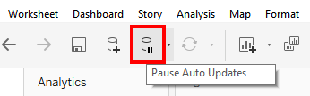
Drag Sankey Polygons onto Rows. You will be adapting a whole number of table calculations. Every time you adapt anything, Tableau will recalculate your view. If you have a large data source, I suggest you Pause Auto Updates.
Right-click Sankey Polygons and select Edit Table Calculation. We will be going through every nested calculation in here one by one. Make sure to not only select the correct fields, but also to select them in exactly the order shown here. Whenever concrete fields are named, the Compute Using is set to Specific Dimensions.
Path Index
- Path Frame (bin)
Max Position 1 Wrap
- Path Frame (bin)
Max Position 1
- Dimension 1
- Dimension 2
Sankey Arm Size
- Path Frame (bin)
- Dimension 1
- Dimension 2
Max Position 2 Wrap
- Path Frame (bin)
Max Position 2
- Dimension 2
- Dimension 1
Min Position 1 Wrap
- Path Frame (bin)
Min Position 1
- Dimension 1
- Dimension 2
Max for Min Position 1
- Table (across)
Min Position 2 Wrap
- Path Frame (bin)
Min Position 2
- Dimension 2
- Dimension 1
Max for Min Position 2
- Table (across)
Remember to Resume Auto Updates.
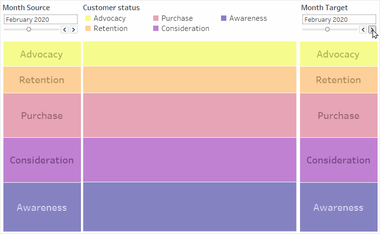
You should now be able to see the middle part of the Sankey correctly. If something does not seem right to you, check the above calculations again. If it looks just like a stacked bar chart, check that your parameters are set to different dates. When are set to the exact same date, your Sankey should definitely look like a stacked bar chart.
Step 11: Dashboarding
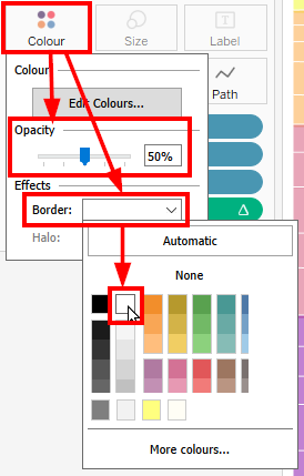
Edit your vertical axis to be Fixed from 0 to 1, then hide header. Edit your horizontal axis to be Fixed from -6 to 6, then hide header there, as well. I personally like to reduce Opacity to 50% and to add a Border in white.
Create a second sheet. Drag your Chosen Measure onto Rows, right-click and add a Quick Table Calculation, Percent of Total. Edit the axis to be Fixed from 0 to 1, then hide header. Drag Dimension 1 onto Colour and Label. Reduce Opacity to 50% and add a white Border, if you like. Sort in a reversed order to your sorting in the Sankey part. Under Size, drag the slider to the right-most position.
Duplicate this sheet and replace Dimension 1 with Dimension 2. Adapt the sorting.
Since both dimensions should contain the same values, seeing as they stem from the same field, you will need to adjust both colour legends if you choose to change anything.
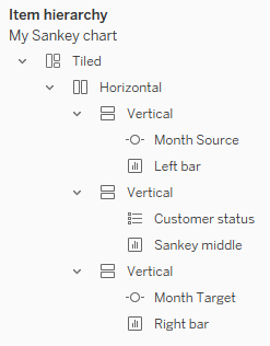
Create a dashboard. You will probably nest three vertical containers into one horizontal container to get the layout you want. In each vertical container, you will have one sheet and either a parameter (for the stacked bars) or a colour legend (for the Sankey). Hide sheet titles. Ensure that the parameters and your colour legend have the same height.
Everything should now line up perfectly. If it doesn’t, check your axis settings (either you fixed them to the wrong values, or you forgot to fix them entirely), your padding, and your sheet fit (all three sheets should be set to Entire View).

Bonus step: Actions
Personally, I like some interactivity in my dashboard. So I have set up four highlight actions:
Action 1:
- Source sheet: Left bar
- Target sheet: Sankey
- Target highlighting: selected fields, Dimension 1
Action 2:
- Source sheet: Right bar
- Target sheet: Sankey
- Target highlighting: selected fields, Dimension 2
Action 3:
- Source sheet: Sankey
- Target sheet: Left bar
- Target highlighting: selected fields, Dimension 1
Action 4:
- Source sheet: Sankey
- Target sheet: Right bar
- Target highlighting: selected fields, Dimension 2
Another bonus step: Combined field
You may want to use a field in your view that combines Dimensions 1 and 2, for whatever reason (Actions and colouring being the most likely reasons). Make sure to have it underneath Dimensions 1 and 2 in the marks card, but above Path Frame (bin).
This will throw all your carefully computed nested table calculations for a loop. Adapt all table calculations (see Step 10) like this:
- If only Path Frame (bin) is specified, or if the computation is set to Table (across), leave this as-is.
- If both Dimension 1 and Dimension 2 are selected in whatever order, you need to select the combined field, as well. Move this combined field to be underneath both Dimensions 1 and 2, in whatever order those two may be according to Step 10.
Disclaimer: This may not work
I built a Sankey chart with five different data sets, following the above instructions to a T (pun somewhat intended). In three instances, they worked like a charm. In two instances, the Sankey arms were weirdly layered on top of one another (easily visible by reducing Opacity). Even using one of the workbooks where the Sankey worked correctly and replacing the data source resulted in the layered, dysfunctional version.
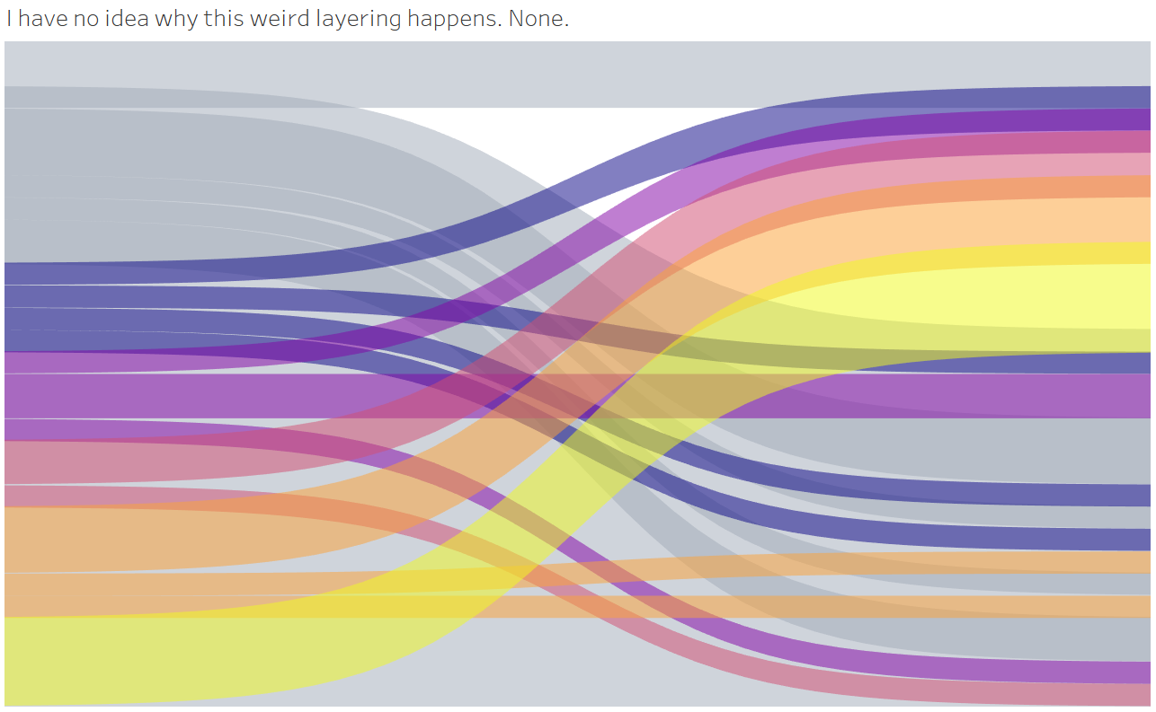
I have been unable to determine why that happens and how to correct this behaviour. My best guess is, your data source may have too few values. Why that should make a difference, I have no idea.
If these instructions worked for you, good for you! If they didn’t, I probably cannot help you. But I will read your findings with great interest once you publish a blog post on why this behaviour happens and how to solve it. Thanks!